


A Rebrand Is Not Just a Visual Update
When a restaurant rebrands, the most visible changes usually involve the logo, interior design, menu direction, and photography. The website often becomes an afterthought, treated as something that simply needs to “match” the new look. In reality, the website plays a structural role during a rebrand. It becomes the bridge between the old identity and the new direction, especially for returning customers who are trying to understand what has changed.
A restaurant website during a rebrand should not only reflect new visuals. It should clarify the shift in positioning. Has the concept evolved from casual to upscale? From family-oriented to cocktail-forward? From neighborhood staple to destination dining? Without explicitly communicating that transition, customers are left to interpret the change on their own. Which can look like patrons getting confused and thinking that ‘they’ve got the wrong restaurant-perhaps, it’s on this other street’. Branding based clarity and positioning is key to preventing these kinds of misunderstandings.
Clarifying the New Positioning
Rebrands often happen because the restaurant has matured, refined its cuisine, or shifted its target audience. The website needs to articulate that clearly rather than assuming visitors will infer it from imagery alone.
If the restaurant has elevated its pricing and experience, the tone, layout, and content depth should reflect that maturity. If it has simplified its concept or moved toward a faster-casual model, the site should emphasize clarity, accessibility, and efficiency. Positioning decisions affect everything from homepage structure to menu presentation to reservation flow.
Without this clarity, the website risks creating confusion, particularly among repeat guests who remember the previous version of the brand.
Managing Existing Customer Expectations
One of the more delicate aspects of a restaurant rebrand is how it impacts existing customers. Some will be excited. Others may be skeptical. The website can either soften that transition or amplify the tension.
Language matters here. A short note from the owner explaining the evolution, subtle references to continuity, or clear messaging about what remains consistent can reduce friction. At the same time, overemphasizing nostalgia can undermine the confidence of the new direction. The balance requires restraint.
The website becomes a controlled environment for setting expectations before someone walks through the door.
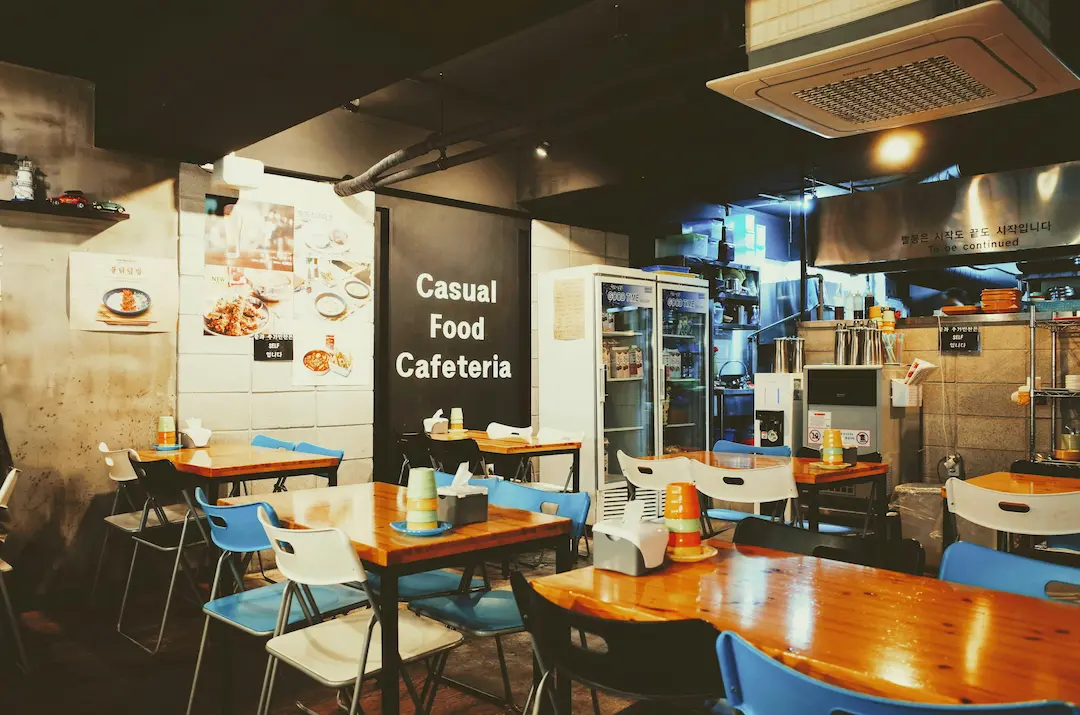
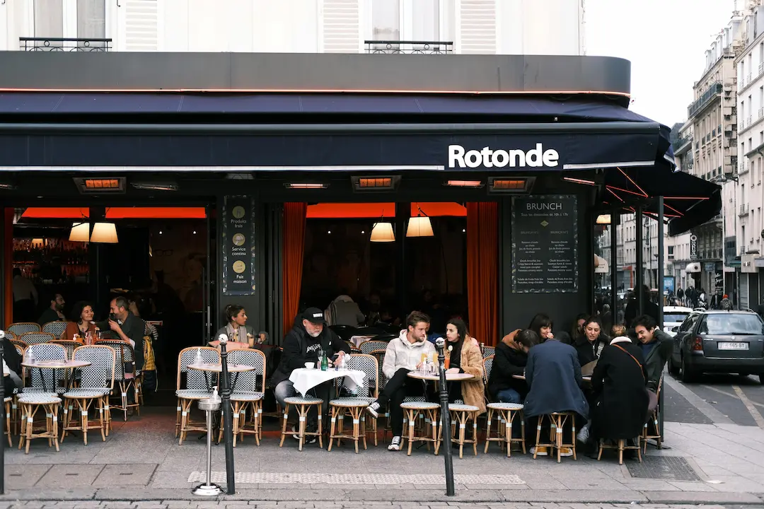
Visual Direction and Digital Consistency
Restaurant rebrands often invest heavily in interior design, plating, and photography, but the website may lag behind in production quality. This disconnect is immediately noticeable, particularly in markets where dining is competitive and image-driven.
Typography, spacing, image treatment, and motion should feel consistent with the physical experience of the space. A refined dining room paired with a cluttered, template-driven website creates cognitive dissonance. Conversely, an understated restaurant with a visually overdesigned website can feel misaligned.
The goal is not maximalism. It is cohesion between digital presence and physical atmosphere.
Menu Architecture and Usability
Menu presentation is often one of the most overlooked strategic components of a restaurant website. During a rebrand, menus frequently change in scope, pricing, and organization. Simply uploading a PDF of the new menu rarely supports the broader repositioning.
The structure of the menu online should reflect how the restaurant wants to be experienced. If dishes are meant to be shared, the layout can signal that. If the concept centers around seasonal rotation, the website should accommodate updates without feeling unstable. If the pricing has shifted upward, the presentation should feel intentional rather than apologetic.
Digital menu structure influences perception as much as the dishes themselves.
Reservations, Ordering, and Operational Flow
A rebrand often coincides with operational changes such as new reservation platforms, updated ordering systems, or revised event booking processes. The website must integrate these tools without overwhelming the visitor.
Clear pathways to reservations, private dining inquiries, or takeout ordering reduce friction. If the restaurant is repositioning as more experiential or high-touch, the flow should feel curated rather than transactional. If speed and convenience are central to the new direction, usability becomes even more critical.
The website should support how the restaurant now operates, not how it used to.
Innovation Without Confusion
Restaurants are visually expressive businesses, and rebrands often introduce bold creative direction. Innovation online can reinforce that energy, but it should not compromise clarity. Experimental navigation, excessive motion, or heavy media can slow down performance and frustrate users who simply want to make a reservation.
The most effective restaurant rebrand websites feel intentional rather than dramatic. They support storytelling, highlight atmosphere, and communicate identity, while still making practical actions easy.
Strategy Before Aesthetic Refresh
A restaurant rebrand website strategy begins with questions about identity, audience, and operational goals rather than color palettes and animations. What has changed, and why? Who is the restaurant for now? How does the digital experience prepare someone for the physical one?
Without answering those questions first, the redesign risks becoming cosmetic. With clear answers, the website becomes part of the rebrand itself rather than a reflection of it.